What is "Dune"?
Dune is the design system created within the Digital factory to standardize the journeys of AXA France both on the website and in the client area.
Why "Dune"?
Evolving, dynamic, made up of multiple micro-elements… it is the emblem chosen by the AXA France Digital Factory to name our Design System.
A dune is made up of a multitude of grains of sand, similar to our design system which consists of a multitude of atoms. These atoms come together to create our components that form our pages, our sites, and ultimately, our digital ecosystem.
Like dunes, shaped and pushed by the wind, our Design System evolves over time. As our needs and usages change, Dune grows with us.
Creation
Initialization of a UI kit
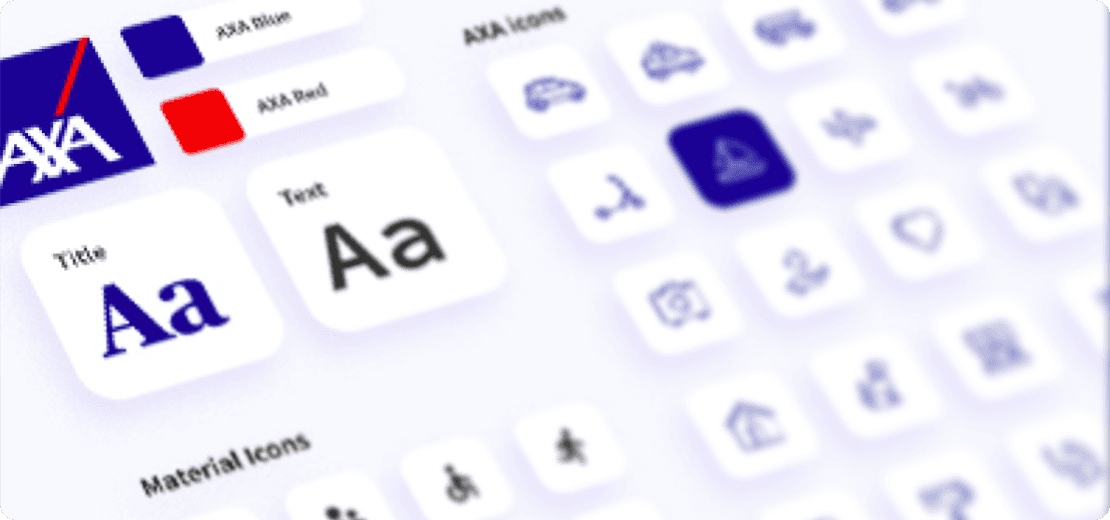
Initially, we gathered the various libraries on Figma to create a common base (typographies, font sizes, colors, etc.). Then, we worked on the different components present in the journeys. During this period, the goal was to eliminate duplicates, write documentation, and update our components to make them more versatile for both products.
Alignment of Figma and Storybook
Once the first version of the component library was created on Figma, it was time to update the developers' Storybook and add the new components.
To achieve this goal, I led a weekly meeting with the dev team and designers to discuss progress, share updates, and address questions.
Creation of Zeroheight
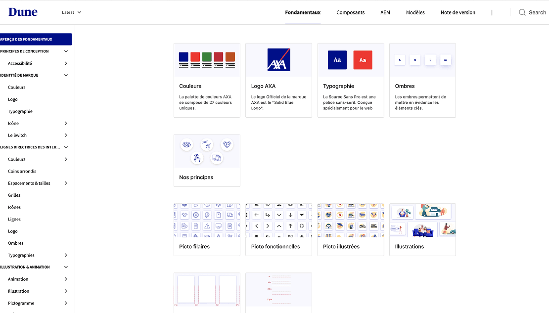
Once the work was underway, we decided to create a Zeroheight to easily share with all stakeholders of AXA France projects the updated components, both in Figma and Storybook versions.
Indeed, Zeroheight allows the integration of Figma files and components as well as the Storybook viewer to have a common tool.
Creation
Initialization of a UI kit
Initially, we gathered the various libraries on Figma to create a common base (typographies, font sizes, colors, etc.). Then, we worked on the different components present in the journeys. During this period, the goal was to eliminate duplicates, write documentation, and update our components to make them more versatile for both products.
Alignment of Figma and Storybook
Once the first version of the component library was created on Figma, it was time to update the developers' Storybook and add the new components.
To achieve this goal, I led a weekly meeting with the dev team and designers to discuss progress, share updates, and address questions.
Creation of Zeroheight
Once the work was underway, we decided to create a Zeroheight to easily share with all stakeholders of AXA France projects the updated components, both in Figma and Storybook versions.
Indeed, Zeroheight allows the integration of Figma files and components as well as the Storybook viewer to have a common tool.